Get Graphic: The Power of Words With Letterer Deron Bennett
Feb 05, 2024
Interview by Troy-Jeffrey Allen

It is officially Black Futures Month here at PREVIEWSworld. This means that we'll be spotlighting Black creators and Black-owned companies in a series of weekly interviews throughout February!
Kicking things off is a name you may not be immediately familiar with but their letters are all over some of your favorite titles. We're talking about the comic book lettering firm known as AndWorld Design and its owner Deron Bennett.
From Deron's philosophies on making comics to lettering comics -- get an exclusive first look at the process in this week's installment of "Get Graphic."

Firstly, what is your name and where do you hail from?
It sounds like I should be entering the ring or something with Michael Buffer announcing. “And in this corner, hailing from the Pearl of the Bayshore--Keyport, New Jersey--we have the Lord of Lettering, Deron Bennett.” Not that bad of an intro, I’d say.
How did you get involved in comics as a reader?
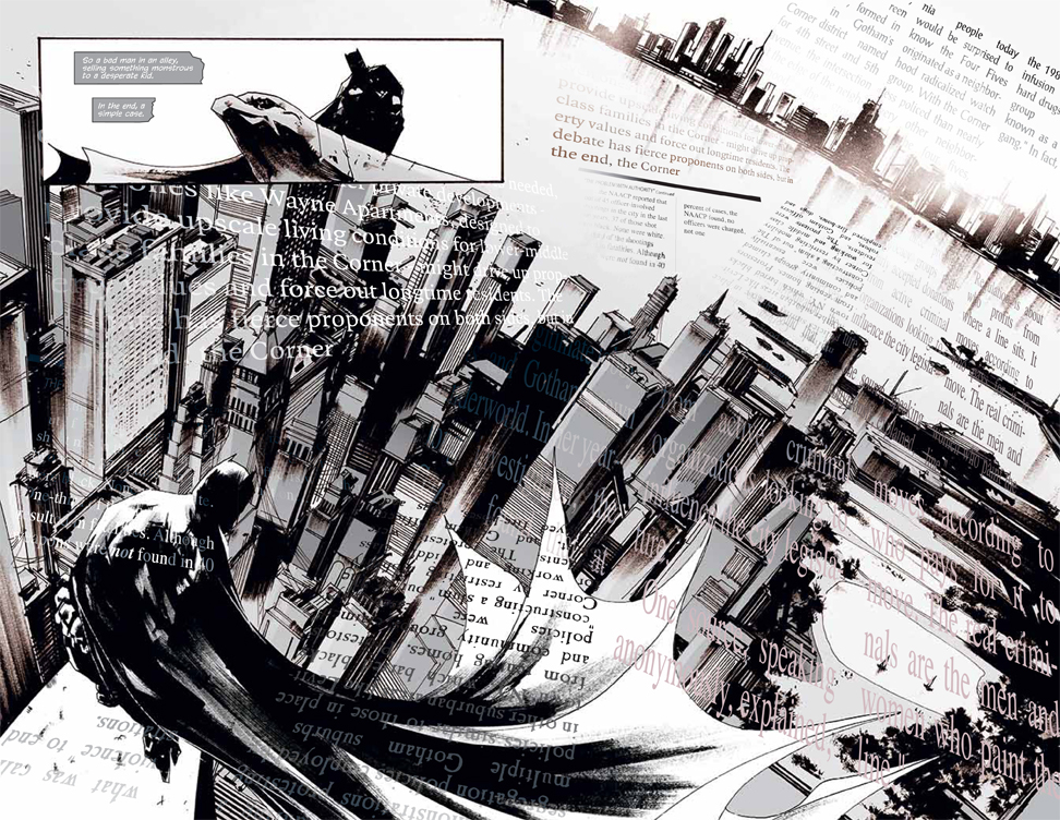
I was initially drawn to comics through comic strips. I was always nosing through the Sunday Funnies for Peanuts, Family Circus, and Garfield. When we would check books out of the school library, I would pick out collections of Calvin and Hobbes, Mother Goose and Grimm, and anything else they had. There was always a Strictly for Laughs page in every Ebony magazine, and it wasn’t long before I got into The Far Side. I just got attracted to that method of storytelling, and the humor won me over.
How did you get involved as a fan?
I slowly started getting into comics in the 90s when X-Men: The Animated Series came out. I was already into Superman and Batman from the movies, but I never really picked up the comics. X-Men was a gateway because my brother and I wanted to learn more. So we would pick up books here and there. I wouldn’t say I was a fan, but I was curious.
Then Milestone hit. Immediate fandom. I picked up every issue of every title and couldn’t get enough. I became a regular at the local shop and would add more books to my collection outside of Milestone. That was really the turning point.
What is AndWorld Design?
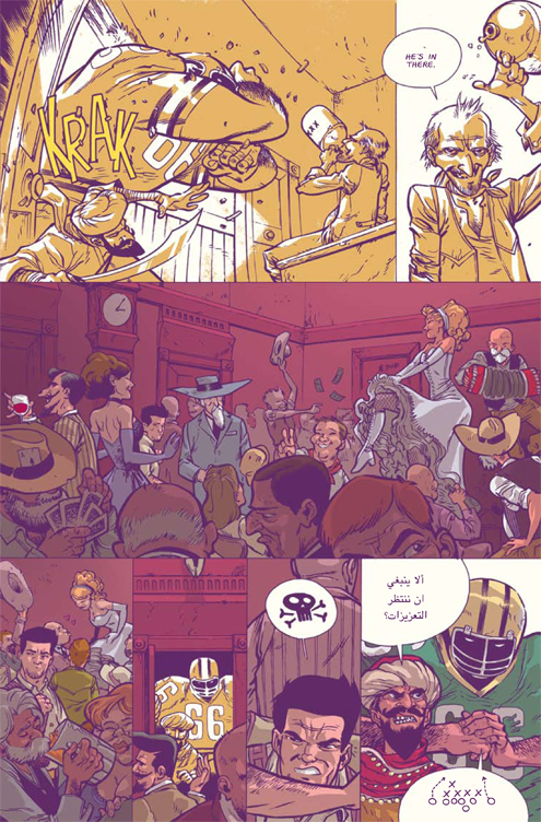
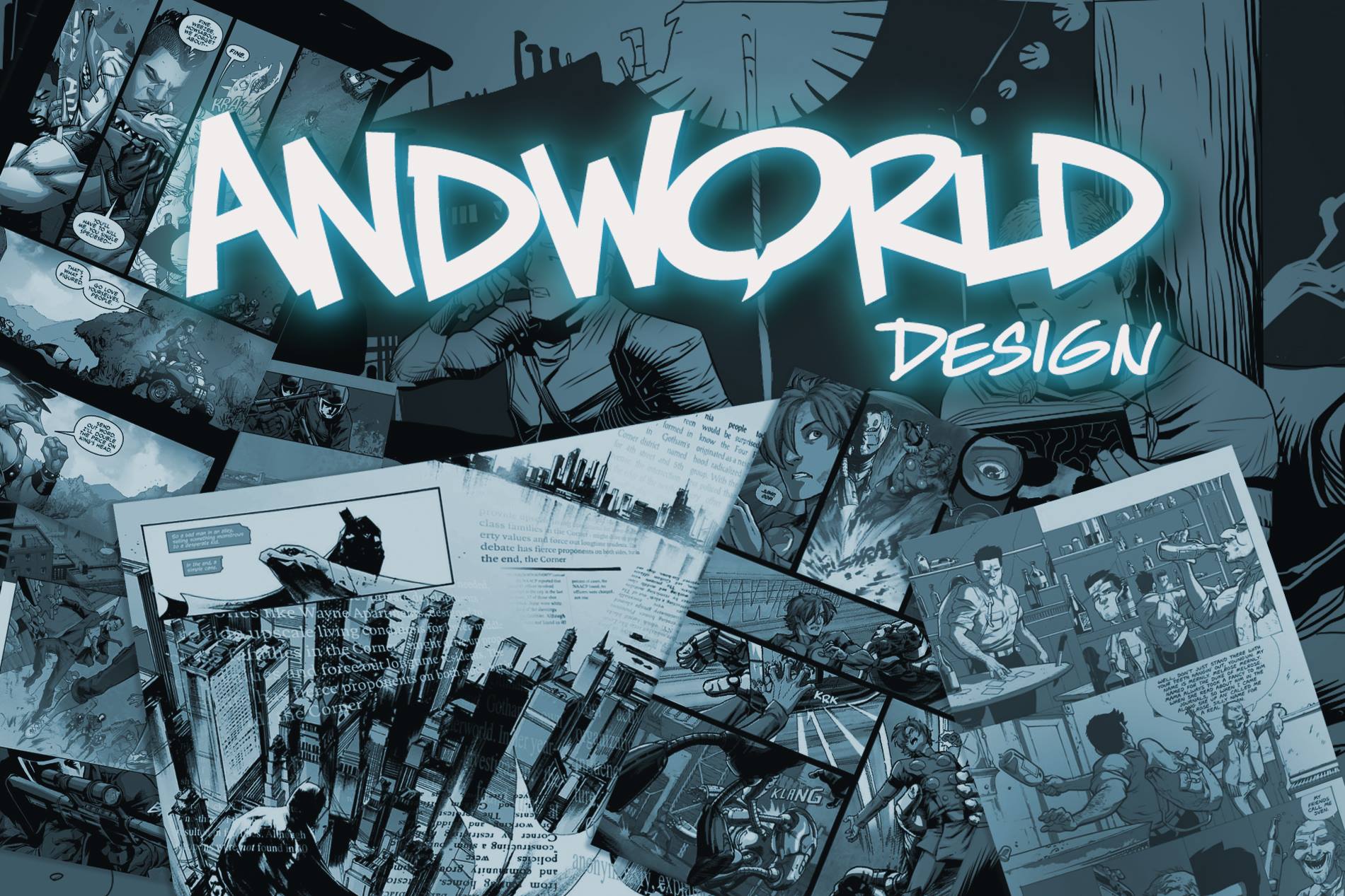
AndWorld Design is the lettering studio I founded to meet the small and large publishers' demands. We work with everyone from independents to DC, Image, and more. I created the studio to share what I was doing in lettering with others. I was blessed enough to have a good deal of work available to the point that I figured I could create a template of what I was doing and show another letterer how to not only do what I was doing creatively but also educate them on the ins and outs of the business. One letterer turned into two, two turned into three, and so on. Now, I have a full-fledged studio with talents, including DC Hopkins, Justin Birch, Tom Napolitano, Jaime Martinez, Erika Terriquez, Josh Reed, and Morgan Martinez. We also have an editorial team helmed by Zoe Maffitt and Kat Vendetti.
What tools do you use to letter?
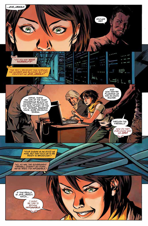
Specifically for U.S. lettering, Adobe Illustrator is king. But I also use InDesign for lettering manga and production. While I don’t letter in Photoshop, I do use it for some creative choices, especially if I want to do some hand-drawn effects.
Does character factor into how you letter a comic?
I’d say the voice comes into play more than the actual character. We are trying to visually convey sounds on a page. So, the character’s voice becomes the primary cue if I’m trying to develop a balloon. Now, there may be times when you start to think in broader strokes when making style choices. For instance, I may create a font or balloon style to identify alien language. However, it is still less about the character and more about what they are saying.
As a letterer, what is your goal when it comes to bringing words to the art page?
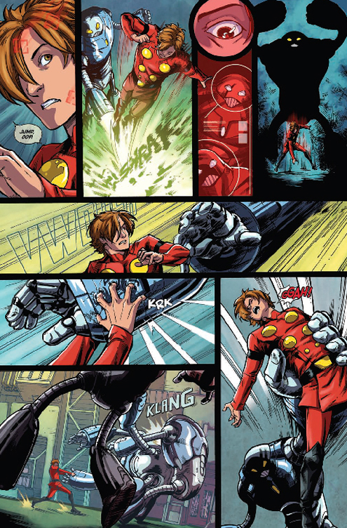
My goal is to help to tell the story. If there is anything that I can do to help make the story more impactful through the lettering, then that’s what I want to do. If there is a way to help the artist, writer, or colorist with what I am adding to the page, those are the opportunities that I look for. You can use lettering to make the quiet moments quiet. A good letterer can play up the drama with text. A good letterer can open the panel with proper placement. A good letterer can help with pacing. A good letterer can lend to or contrast the color palette. The opportunities for storytelling are there. A good letterer will find a way to make the most of them.
Tell us about your process for the book Rare Flavours from BOOM! Studios.
After the successful The Many Deaths of Laila Starr, Ram V, Felipe Andrade, and I teamed up again for BOOM’s Rare Flavours. We were looking to develop a new narration style for the main character that reflected his journal entries. So here is the breakdown of the process.
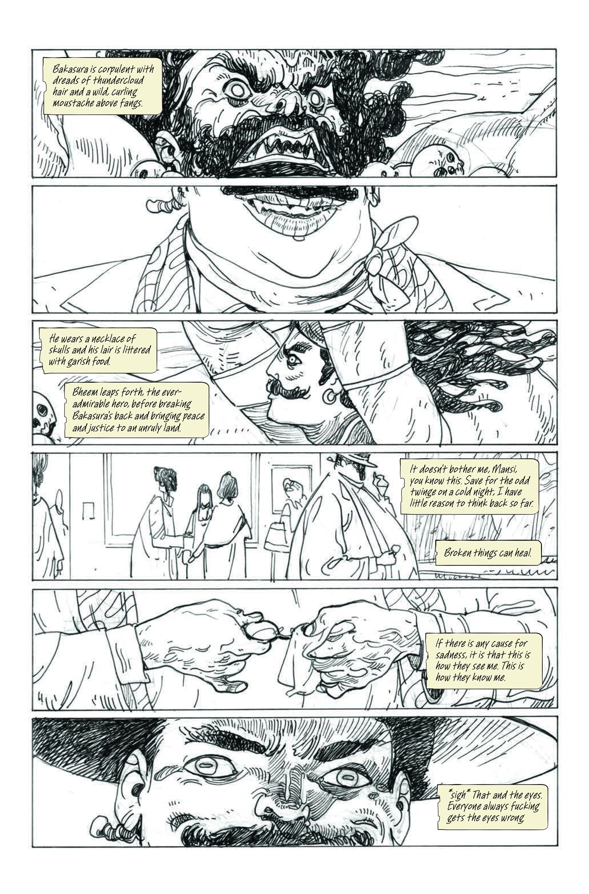
Page 1: I wanted to avoid doing the traditional ragged captions we see for journal entries. I was thumbing through my journals for inspiration to see what sort of new caption I could develop. I tore out a page, and this style stood out to me. The single ripped side of cream-colored paper with clean rounded edges seemed like the right tone for a caption box based on a journal entry. I also used a handwritten font in sentence case to sell the point.
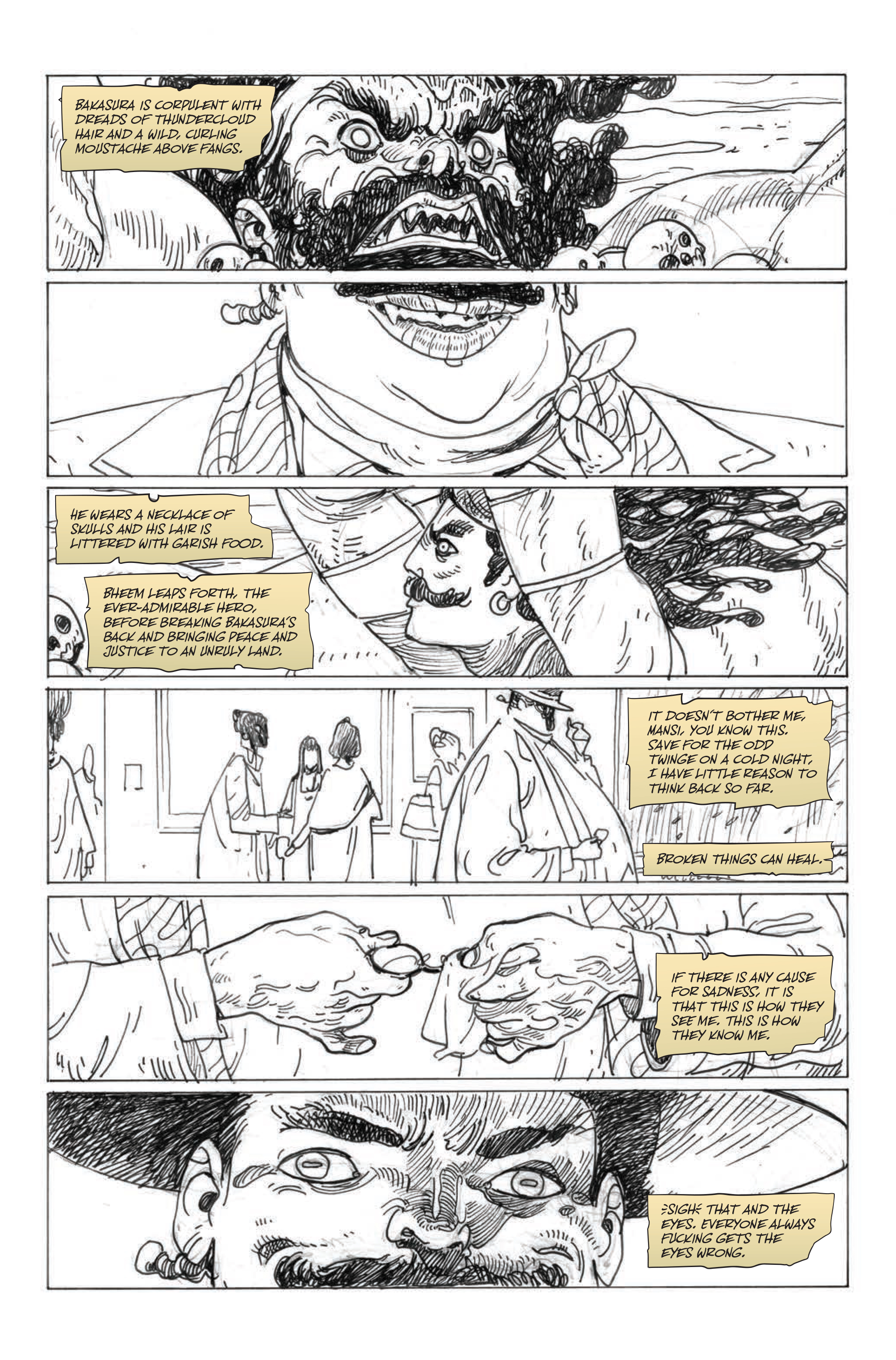
Page 2: The editorial team still wanted to lean into the torn paper look that readers can readily identify. So I dug into my bag of tricks and found a couple tattered captions that reflected what they were looking for. This first attempt kind of hugged the narration with ripped edges. I maintained the mixed case but tried an alternate, wider font that can be easily read.
The second option was a little more parchment-like. Without giving too much away, the protagonist, Rubin, isn’t human, and the parchment can be associated with the sort of being he is. The shapes are a little more flowing and organic, like Felipe’s art. We also wanted to tie the style together using the same font as the dialogue, so that was incorporated here. This ended up being the style the team selected.
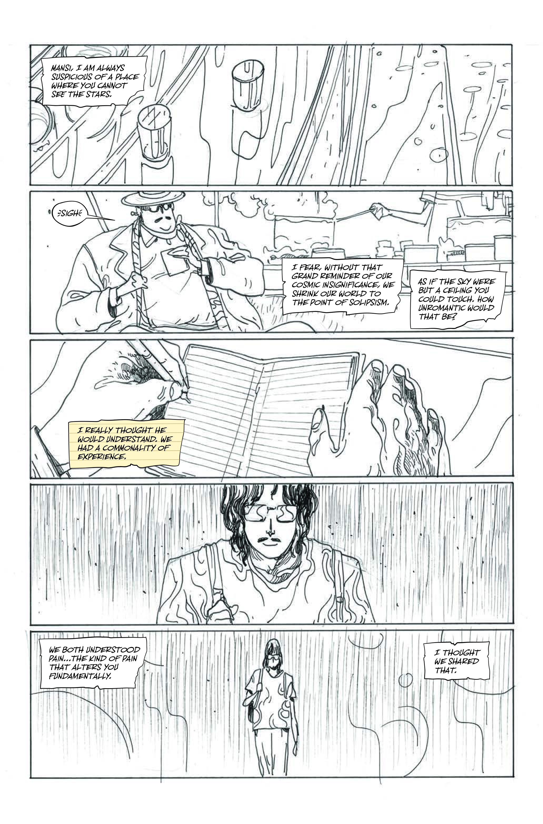
Page 3: When I got to the page where Rubin was actually writing in his journal, I noticed that it had lines in it. We hadn’t discussed it before, but I wanted to bring parallels from the notebook to the caption, so I added lines to see if that would work. We eventually decided not to use it to keep things simple.
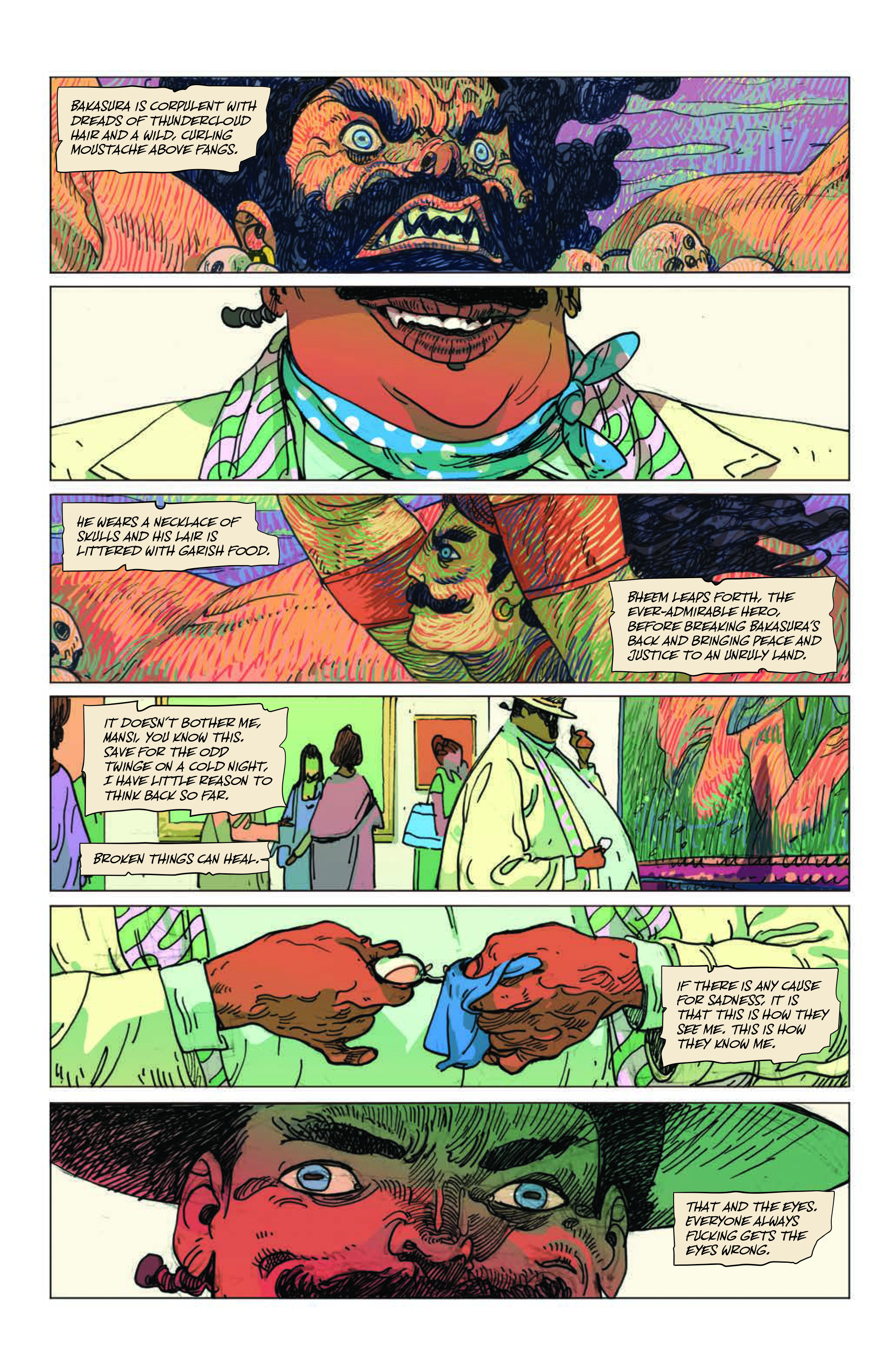
Page 4: Over the final colors, I adjusted the placement to reveal more of the art. Over inks, things aren’t as identifiable. Once the colors are added, the visuals really come into focus, and you want to ensure you are attacking the page correctly. So, I shifted some captions and adjusted the color to play with the values better.
Be sure to check out Deron's writing debut within the pages of DC POWER. In comic shops now.
If you want to discover more of Deron Bennet's work, follow him at @dbenne20 on Instagram. And be sure to follow @andworlddesign for more.
And keep an eye on PREVIEWSworld.com's Twitter, Facebook, or Instagram for more artist spotlights!
****
Troy-Jeffrey Allen is the Consumer Marketing Manager for Diamond Comics Distributors and PREVIEWSworld.com. He is also the writer of comics such as MF DOOM: All Caps, Public Enemy's Apocalypse '91: Revolution Never Sleeps, O.D.B.: Lyrical Ruckus in the City, and the Glyph Award-nominated Fight of the Century.


