Best of 2023 Interview: Horny Kaijus in Love (And The Chaos That Follows)
Dec 26, 2023
Interview by Troy-Jeffrey Allen
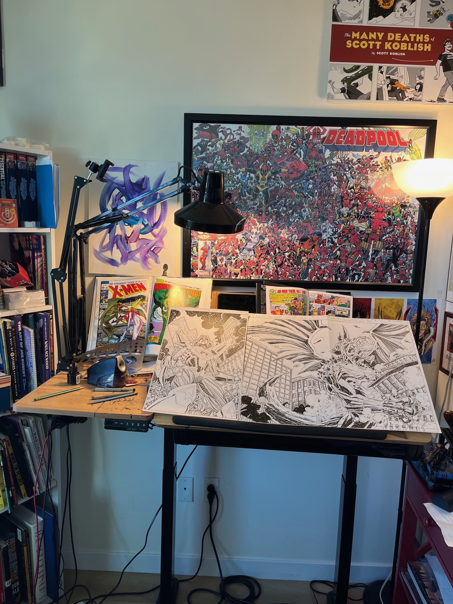
As 2023 lets the door hit it on the @$$ on the way out, I (me) wanted to focus on the comics and graphic novels that entertained us this past year. Welcome to the first of a handful of interviews spotlighting what I deemed "THE BEST OF 2023!"
I took a moment to corner and capture a few writers, artists, writer-artists, and editors responsible for my favorite 2023 page-turners. What I ended up with is a nice spread of mainstream comics, absurdist comics, nostalgic comics, and two giant robot stories (with two wildly different outcomes).
Up first, let's introduce you (again) to The Giant Kokju and its artist Scott Koblish.

Firstly, what is your name and where do you hail from?
Scott Koblish, I’m from the East Coast, but I’ve been in Los Angeles for nearly half of my life now.
How did you get into art? What sparked your initial interest?
I’ve drawn ever since I can remember, at first I drew mostly things from the television or real life, lots of firefighters for some reason, but I fell in love with comic books around seven years of age and then just dove into that. I started going to the Joe Kubert School of Graphic Arts and Design at nine years old and stayed there until about sixteen. Joe was my first teacher, he was incredibly patient with me, for which I am very grateful.
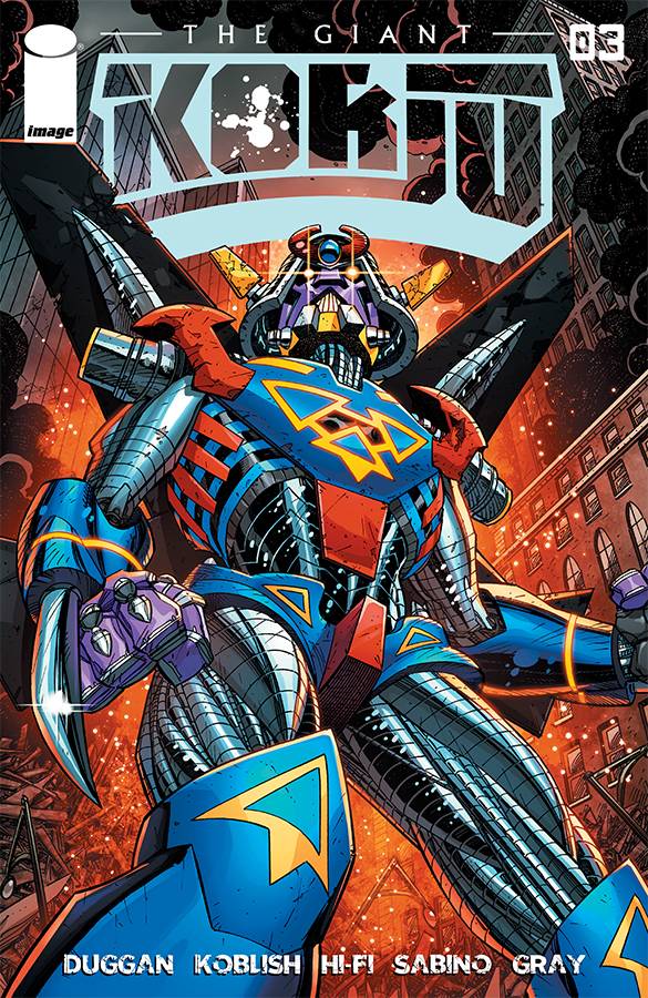
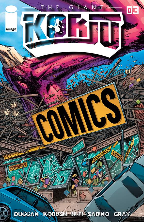
What can you tell us about The Giant Kokju? What is it about?
Gerry came to me with the idea, and I had never really heard anything as outrageous as that initial pitch. There was a lot of funny stuff that could be mined from it, so I jumped on board. It’s essentially the story of a Giant Kaiju, a monster that personifies the worst that humanity has wreaked on the environment through endless and careless destruction caused by our most basic and base needs, and the monster comes ashore to dole it back out again. The monster functions as a giant metaphor, and as it’s slamming it’s giant … metaphor into buildings and destroying a teeming city, the story becomes about the desperate race to stop the monster in the only way a divorced, washed-up scientist, with a grudge against the system, can do best.
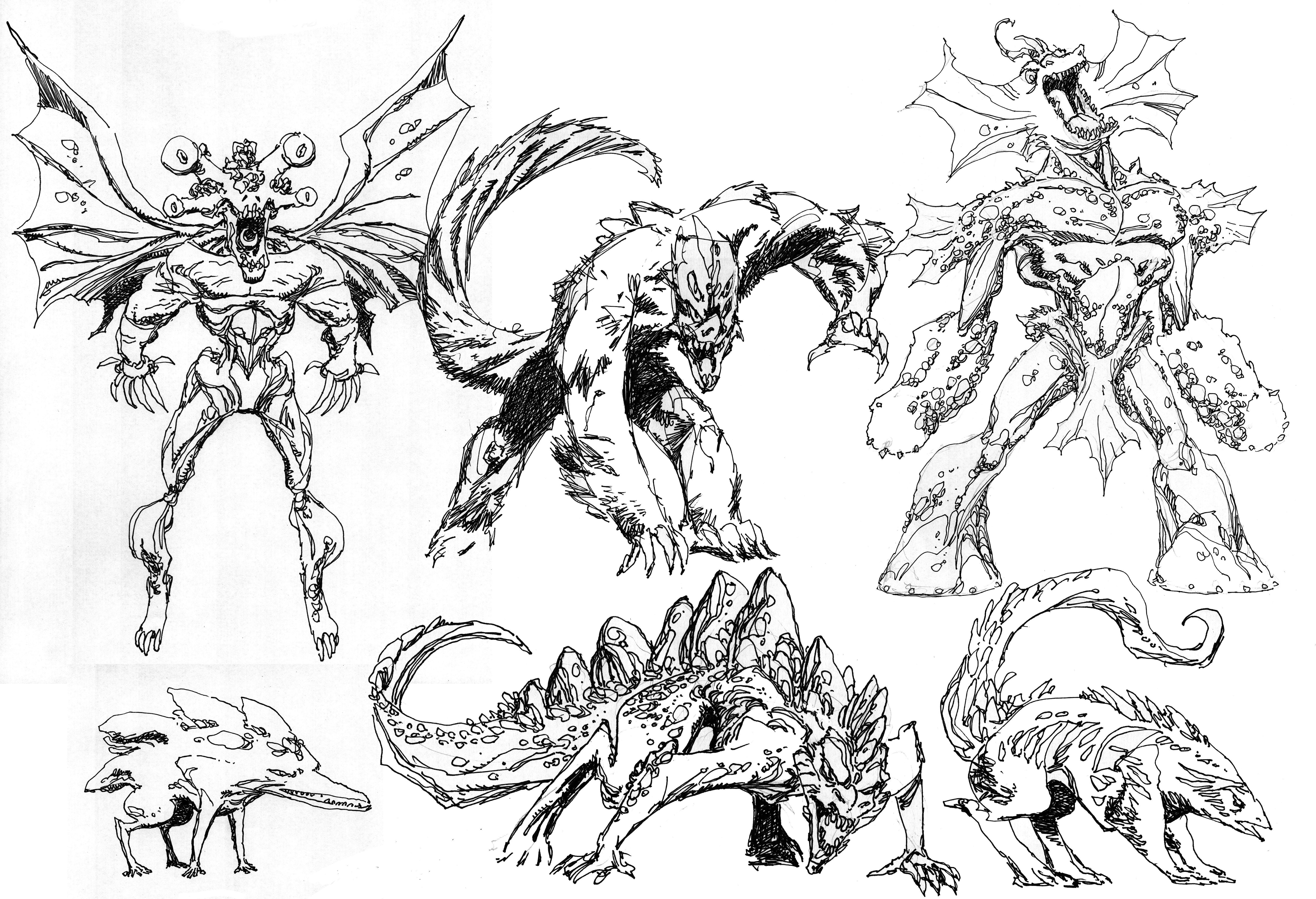
Can you get into your character design process a bit? How do you know when the character has the right look?
Well, monsters are tough. I wanted to grab a few essentials from the Kaiju genre but tweak them a bit. I gave the monster an elongated snout (the better to eat people with), and huge buck-teeth, because I had never seen that before. I wanted to have his tail desiccated and chewed away. I had some plans for the two horns on his head, but couldn’t work out how to properly draw the scene about it without worrying that the world would melt down. I honestly struggled on how to depict the racier elements of the story. After some serious and extended thought, I decided that I just had to commit to being really up-front with it.
Tell us about your collaborators on the book. Who else is on the team?
Well, Gerry is a wonderful collaborator, thoughtful and kind, and Hi-Fi are the best colorists in the business. Brian Miller and talked long and hard about the color scheme for the book overall and the vibe I was intending for the monster and I think they nailed it. They made the book bright and lively, throwing in great additions to plus it, just as an example, I had originally thought the monster’s poop would be brown, but when they colored it lime green, it really made the art jump off the page. I just did a Flash story for DC’s Beast World books and they did a great job over there too. Joe Sabino on letters is always a fantastic choice, he always does a solid job, and we were lucky to have Image’s design team and staff to support us, especially Rich Fowlks, who did a bang-up job with all the pre-press. We had a small team, but I trust all of these folks, they always do top-notch work.
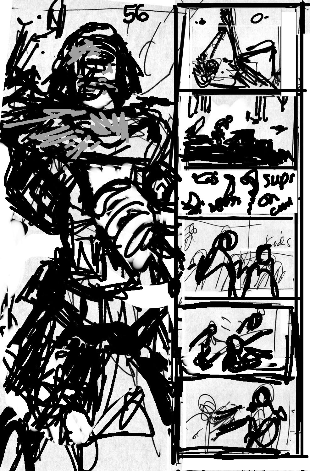
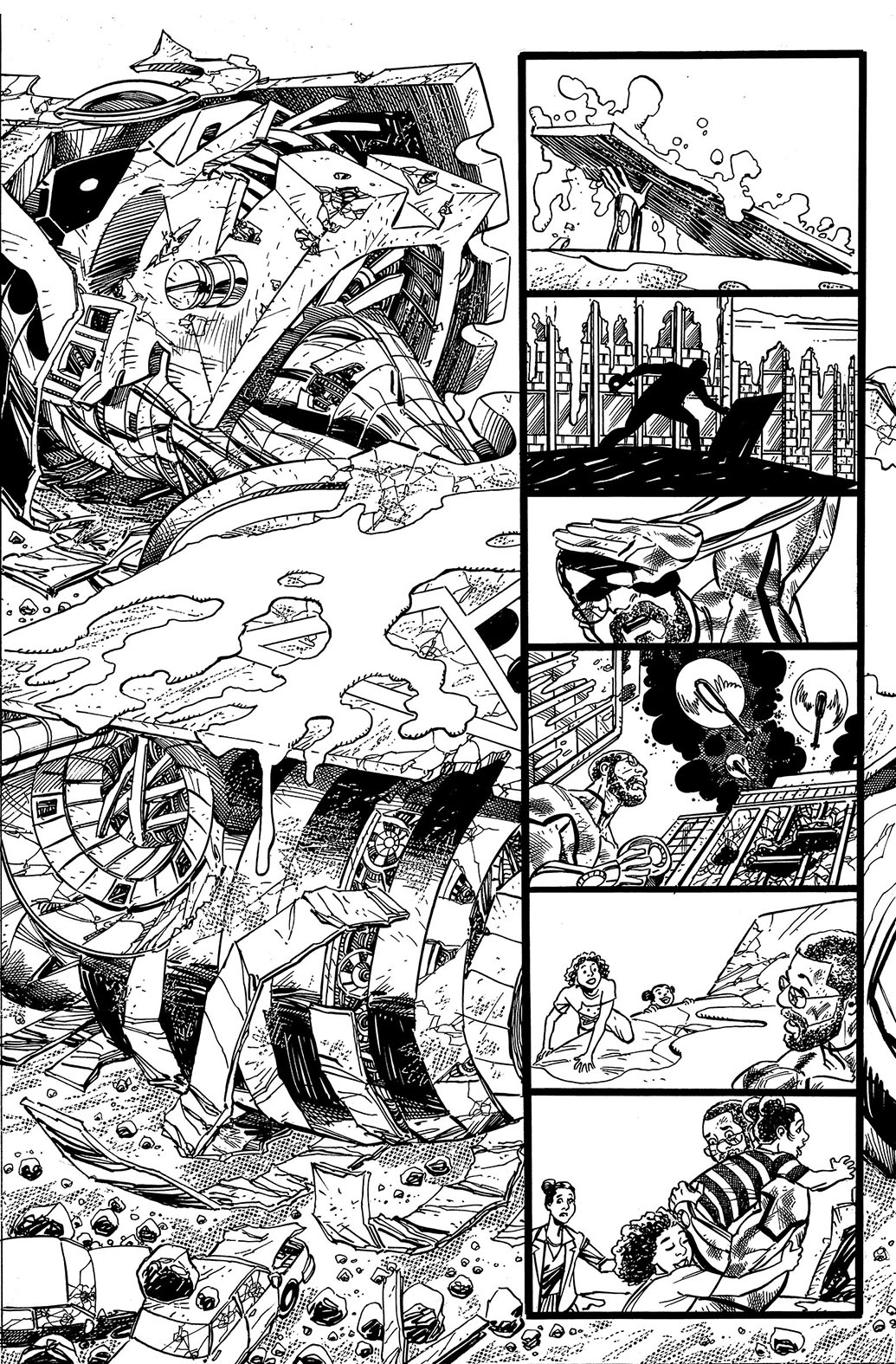
What tools do you use to draw?
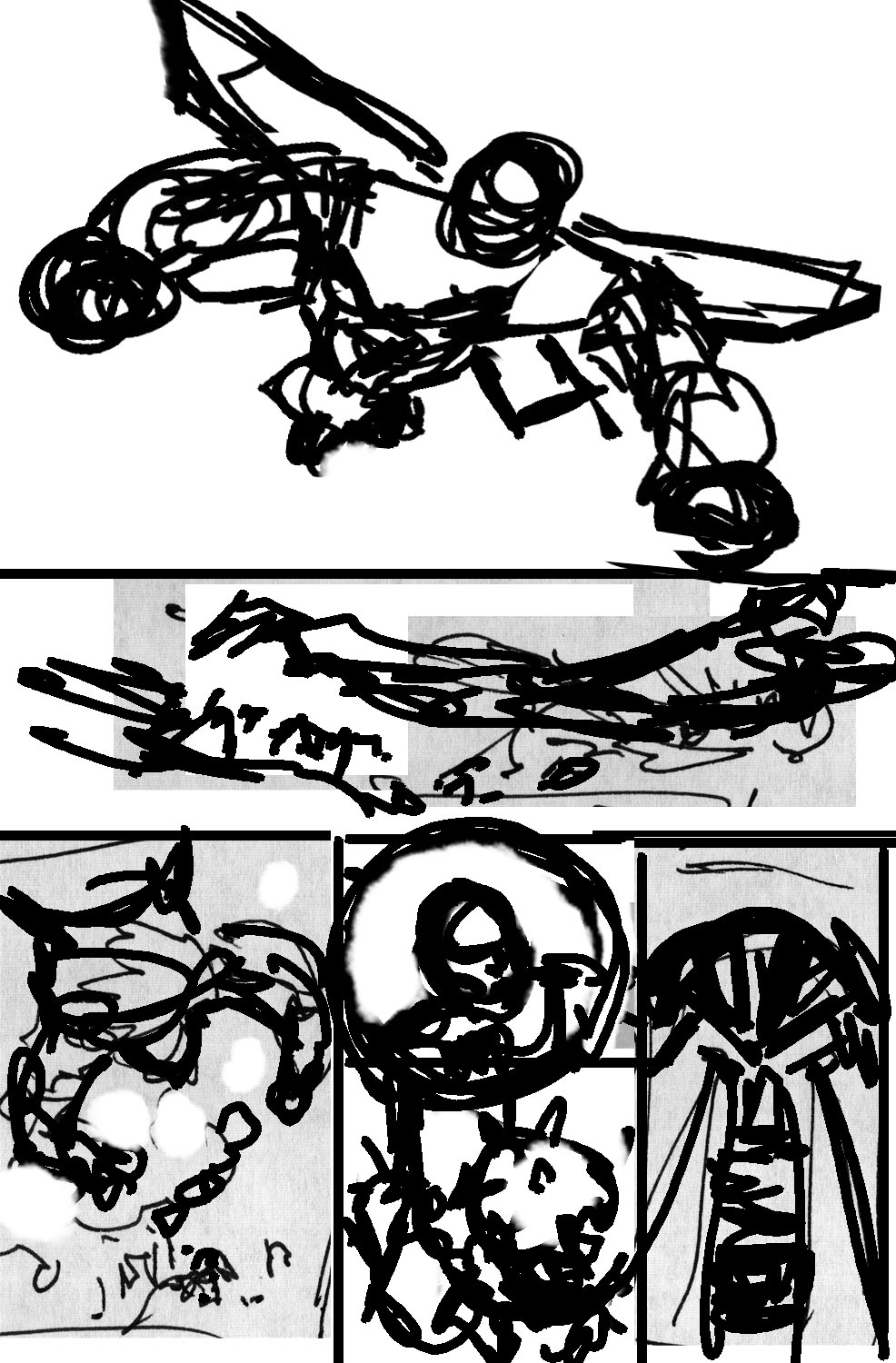
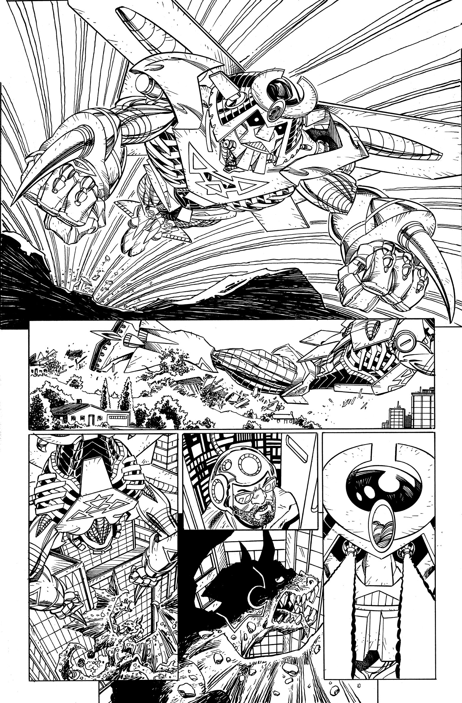
I use old 18th-century tools for the final drawing, but when I’m capturing my thoughts on the layouts I fool around d with the layout in Photoshop. Once I finish the page I scan it and fool around with it a little more, cleaning it up and playing around with some fo the easier elements I think can be tweaked and then I upload it and send it over for color and letters.
In terms of audience, who is The Giant Kokju for?
I want to stress that this is not a book for anyone under 18. And I think that’s ok. We probably don’t have to measure every element of storytelling against every possible audience - if some stories are going to be too much for some people, they might be the story that someone else has been waiting their whole lives to read. We have a lot of humor, gore, and sexual situations in this book, if you know that ahead of time I think you’ll enjoy it.
****
Troy-Jeffrey Allen is the Consumer Marketing Manager for Diamond Comics Distributors and PREVIEWSworld.com. He is also the Consumer Marketing Manager for Geppi Family Enterprises. Troy's work includes MF DOOM: All Caps, Public Enemy's Apocalypse '91: Revolution Never Sleeps, O.D.B.: Lyrical Ruckus in the City, and the Glyph Award-nominated Fight of the Century.


