
Keeping Up With Jones
Feb 27, 2018
 |
by Vince Brusio
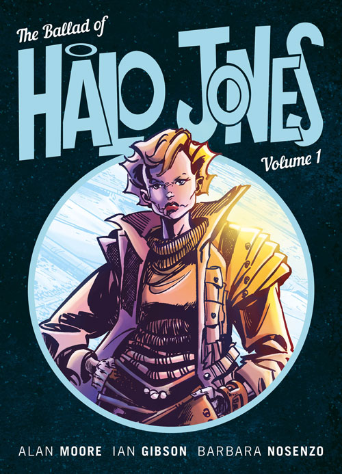
This spring, Rebellion brings Alan Moore and Ian Gibson’s The Ballad of Halo Jones(MAR181845) back to print in three remastered volumes, newly coloured by Barbara Nosenzo. To help promote this return, PREVIEWSworld spoke with Nosenzo to ask what it was like to work on this seminal work of comics’ science fiction.
Note: Owen Michael Johnson is incorrectly cited as responding to our questions for this interview printed in the March PREVIEWS catalog. We apologize for that error. Please note that it is colourist Barbara Nosenzo whom we spoke to for this interview, and the corrected editorial will appear in the April PREVIEWS catalog.
**********
Vince Brusio: How were you approached to work on this project? Tell us how you were brought into the Rebellion fold.
Barbara Nosenzo: I met the Rebellion guys the first time in 2017, in … Angouleme! I showed my portfolio to Ben Smith (publishing director) and Keith Richardson (editor) and soon after they commissioned me the cover for the anthology Summer Magic: The Complete Journal of Luke Kirby, as they were still needing a cover colour artist.
A couple of weeks after my first work, Ben wrote me asking if I was interested on doing some test pages on Halo Jones and... I think I got a heart attack! I mean, THAT Alan Moore? THAT Ian Gibson? And then... me! Obviously I accepted, we did some tests to choose the style and palette and then... here we are!
Vince Brusio: Were you familiar with Halo Jones before you were signed as part of the team to reprint the book?
Barbara Nosenzo: No. I knew Alan Moore, and was a fan of some of his old graphic novels (Watchmen, Top Ten, V for Vendetta, The League etc.) but I never read this story before. I first got a black and white version to read it. While I was reading, colors and atmospheres were coming through my mind, so I immediately fell in love with it!
Vince Brusio: What were some of the objectives you set for yourself in being the new colourist for this book?
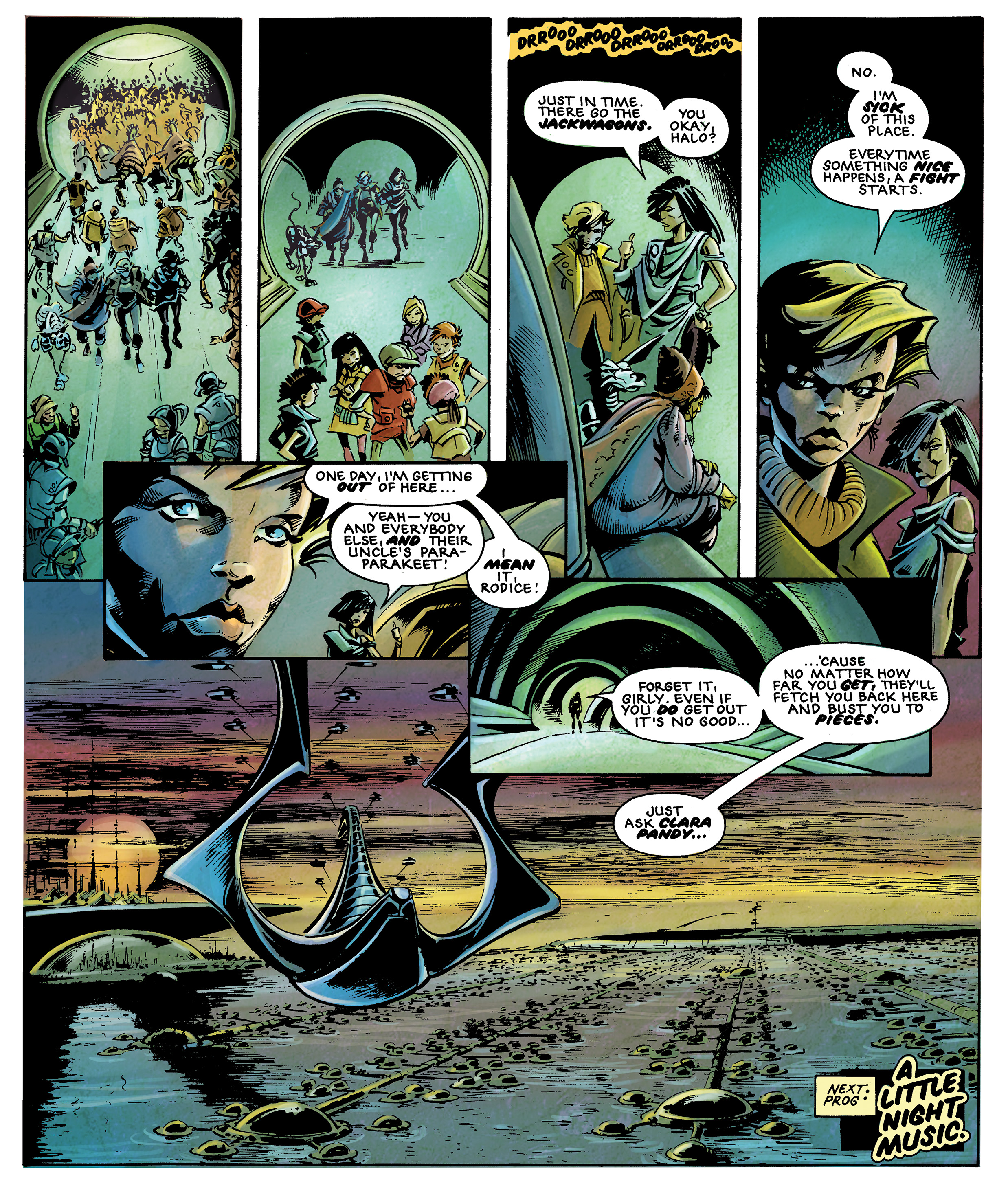
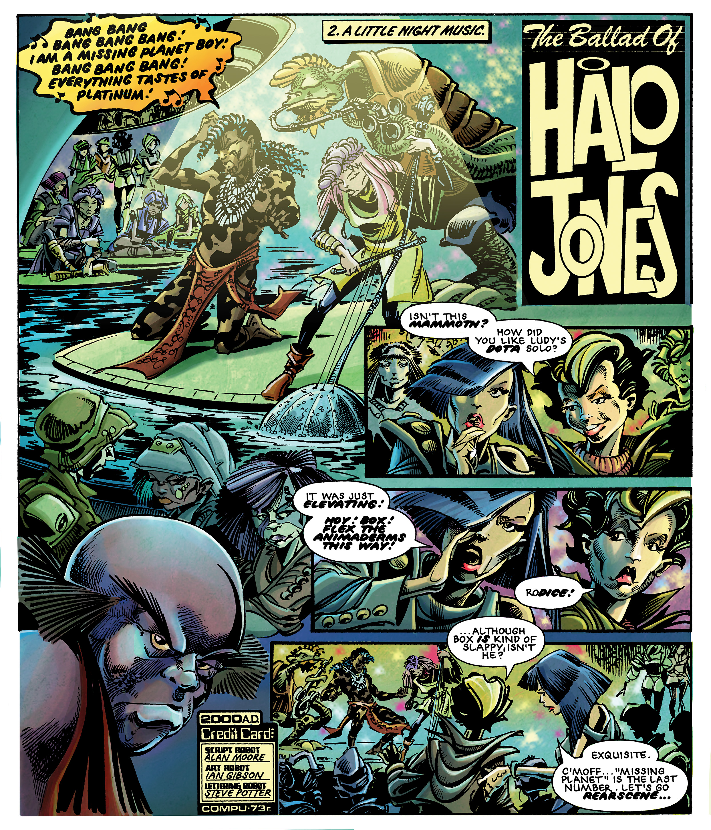
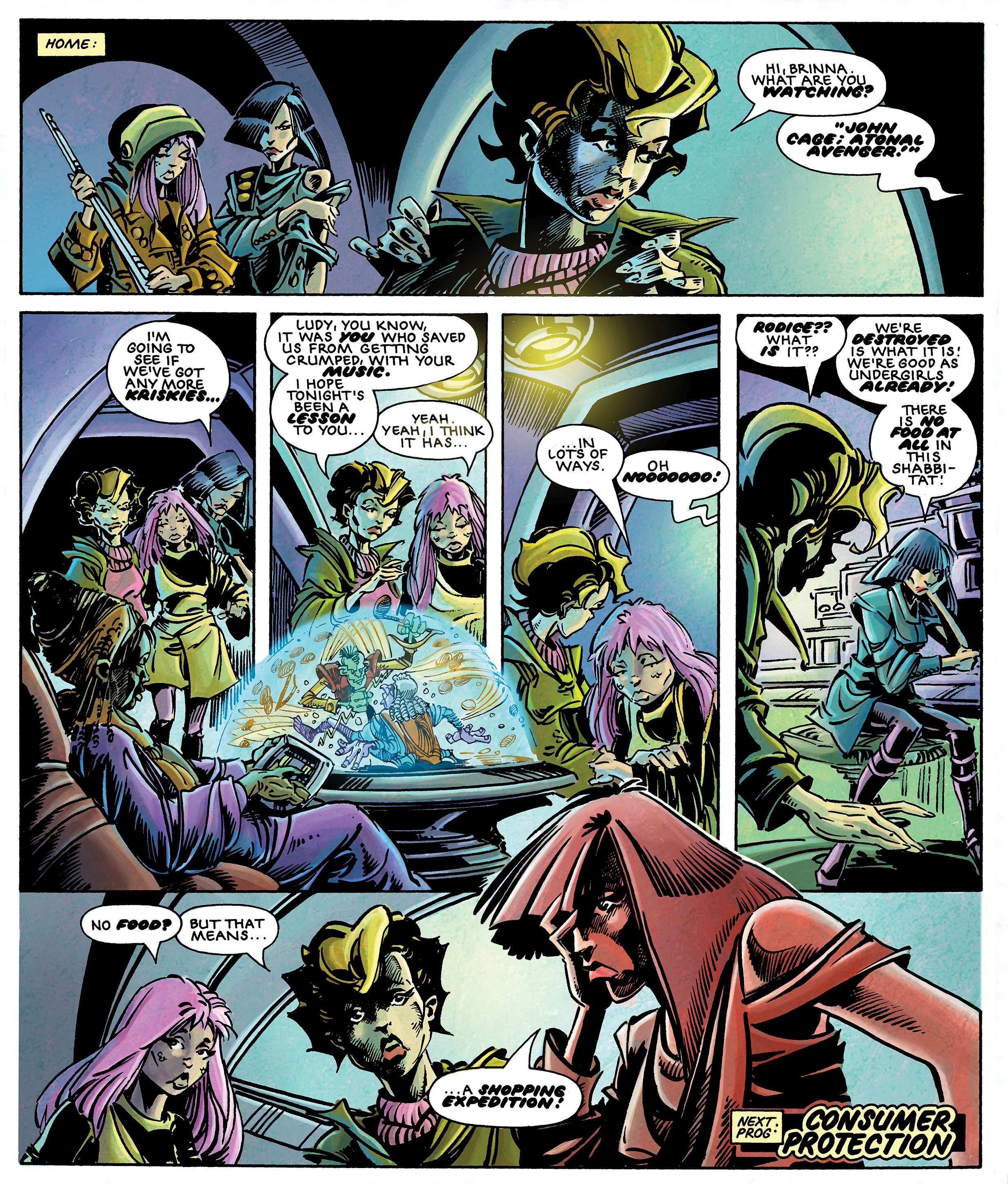
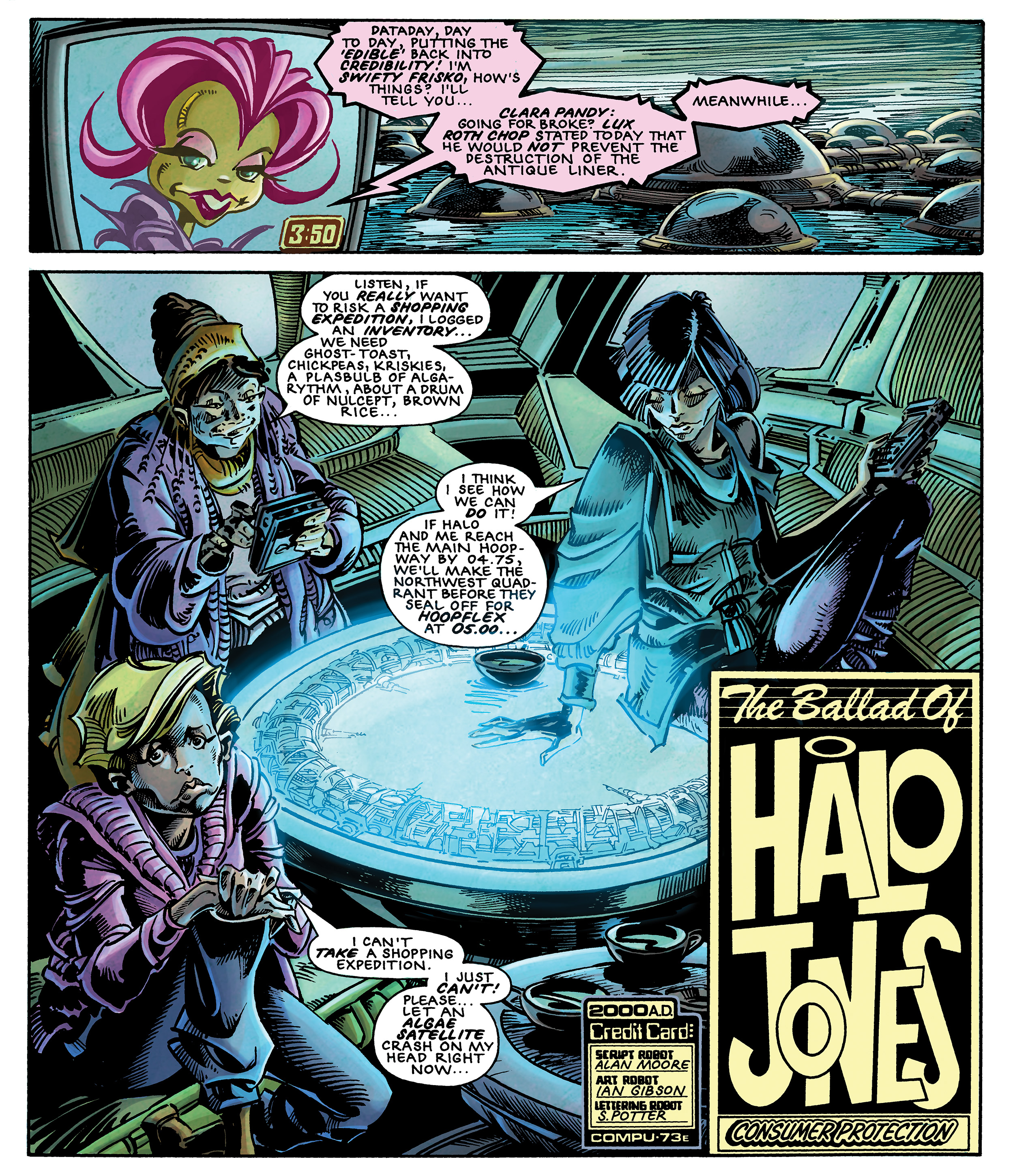
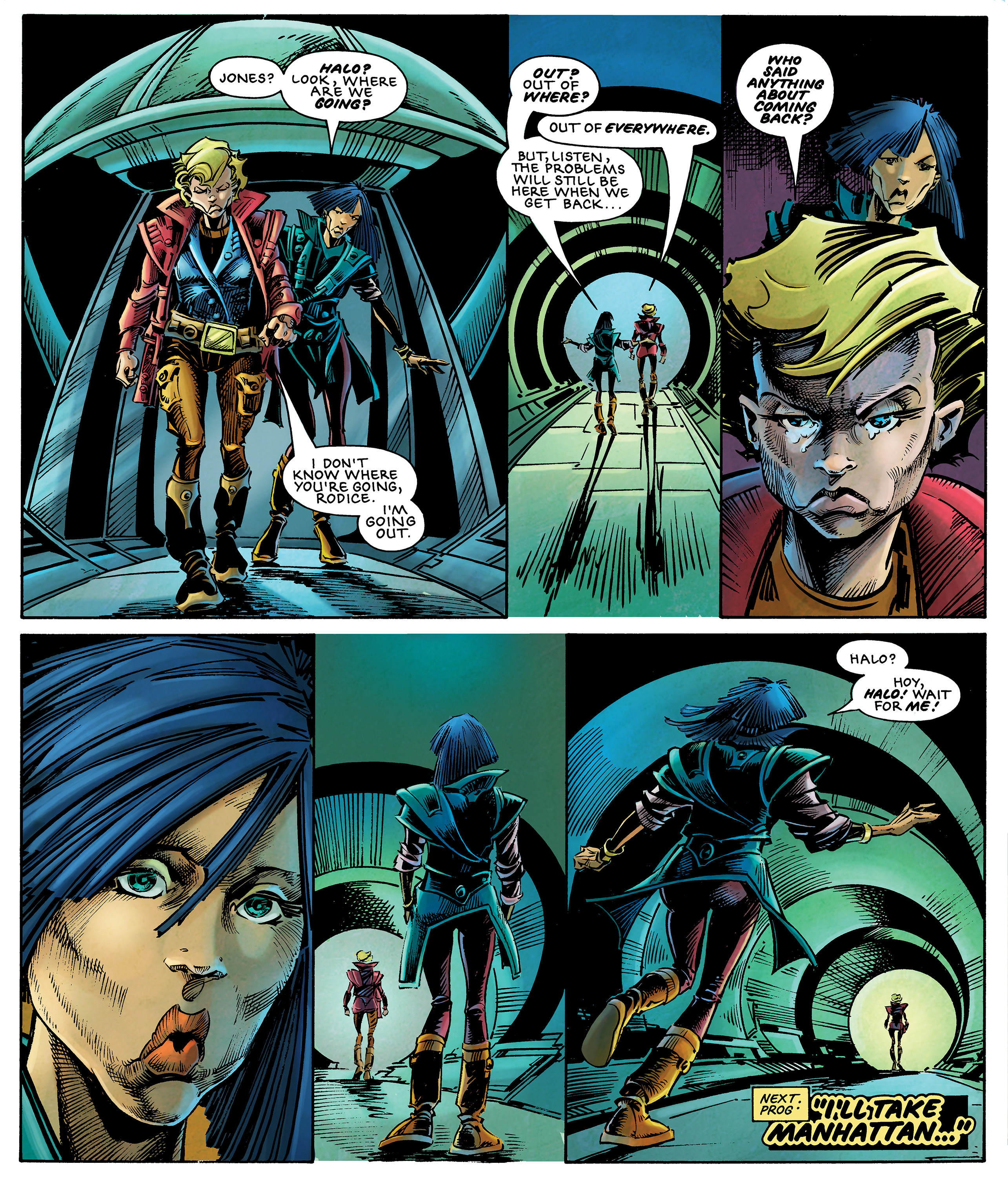
Barbara Nosenzo: First of all, I had to be respectful of the gorgeous black and white work that Ian Gibson did. You know, even if I'm a colourist, I'm a big fan of black and white. The first challenge to me was to add colors without “killing” all the line-art and hatching. Secondary, my purpose was to give different atmospheres along the three books, so as the different palettes could identify a specific period of Halo's life (the Hoop, the Clara Pandy and the War). To obtain this, I chose 3 different ‘ground colors’ that are greenish for the first book, pale yellow (lighter for the second), and, obviously, reddish for the third.
Vince Brusio: How do you see the color schemes you choose as affecting the tone, pace, or weight of this story?
Barbara Nosenzo: I thought about every single color that I used, to create the right mood or to enhance the storytelling. The first book (e.g. the life on the leisure estate The Hoop) is highlighted by a greenish, sick, palette, so that you can feel the chaos and also the useless routine that everybody can feel living like that. On book 2 and 3, instead, the action scenes are underlined by vibrant, warmer colors. That helps the reader get involved in the events. I also use a lot of weird, unusual colours to highlight the situations, e.g. blue faces to accentuate sadness, purple for fear, and so on.
Vince Brusio: In what way did coloring this edition of Halo Jones challenge you as an artist?
Barbara Nosenzo: In many different ways. Emotionally, because of the names involved. Being part of it has been beautiful and scary at the same time, because I always felt the responsibility of this re-styling!
Technically, as I was asked to do adjustments to create continuity solutions where there was just black and white. Deciding which panel looks better without profiles, which could work better leaving a white background to play up that particular feeling. Even also working on contiguous panels, where the floor of a panel becomes the ceiling of the next one... all these circumstances required more than simply coloring.
Personally, I tried to give attention to the smallest details. I'm a huge fan of backgrounds and landscapes, so I tried to put a little of life into small things or people that we see just for a panel. I think that details give the reader that feeling of “plausibility,” and this definitely improves the reading.
 |
 |
 |
 |
 |
**********
Vince Brusio writes about comics, and writes comics. He is the long-serving Editor of PREVIEWSworld.com, the creator of PUSSYCATS, and encourages everyone to keep the faith...and keep reading comics.