
Color Blind For Incognegro
Dec 27, 2017
 |
by Vince Brusio
To tell a good story, you need good characters, even if those characters are bad. Such is the conundrum that Warren Pleece had in illustrating Mat Johnson’s Incognegro: Renaissance #1 (DEC170048) for Dark Horse Comics. It is an all-too familiar Catch-22, which Warren goes on to talk about among other things in our PREVIEWSworld Exclusive interview for this new mini-series which arrives in comic shops next February!
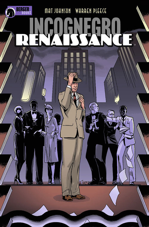
Incognegro: Renaissance #1 (DEC170048) is in comic shops February 7.
**********
Vince Brusio: What emotions does this story stir inside your soul? How do you channel those emotions into the story?
Warren Pleece: I probably feel the same as any decent human would confronted with the all-too recent (and current) stories of hatred and racism that forms the back-drop to Incognegro.
Vince Brusio: Who are your favorite and least favorite characters in the story?
Warren Pleece: I don’t think I can answer that, or at least say I have a favorite. In fiction we’re obviously all rooting for our hero, flaws and all, but Mat’s created quite a host of unlikeable villains here and I’d be lying if I said I don’t enjoy creating these nasty pieces of work for our heroes to pit against.
Vince Brusio: How much liberty does Mat Johnson give you in rendering the art? Is he very specific in what he wants to see, or does he leave quite a bit to your interpretation?
Warren Pleece: Up until now and further on, hopefully, Mat’s been pretty happy with my characterizations, settings and visual storytelling. Occasionally I’ll change something in pre-planning stages with my editor Karen Berger or Richard Bruning, our designer, may have suggestions for the covers. Sometimes, Mat will stress important details to include for authenticity, but most of that will be there already in his scripts.
Vince Brusio: What body language do you try to accentuate in this story to convey the emotions of the characters? Or do you focus more on perspective to tap into that kind of electricity? What switch do you throw or lever do you pull when the intensity of a scene needs to be in the red zone?
Warren Pleece: I draw a lot on film language in my comics and you’ll see a lot of close-ups and cropped angles to create a sense of unease, tension or suspense, even if it’s a bugger to draw. I love a lot of dark shadows and throwing weird shapes over faces as well, so using tones for the new edition of Incognegro and for the Renaissance series, allows me to add a lot more light and shade to the mood I’m trying to get across.
Vince Brusio: As this is a period piece, do you conduct your own research in selecting historical background imagery, or does Mat have specific resources he likes to cite in choosing which scenery we see throughout Incognegro: Renaissance?
Warren Pleece: Mat’s always great with reference material and pointers in his scripts, but I also do a lot of further visual reference for period details and settings, trying to keep it as true to the times as possible; everything from street signs and bars to dresses and suit styles. It’s an important part in the overall storytelling that hopefully the reader will hardly notice as they’re reading, but if they really want to know, that’s a 1920s Kodak 2 Autographic Brownie camera that Zane’s handling in the first issue. Just so you know!
 |
 |
**********
Vince Brusio writes about comics, and writes comics. He is the long-serving Editor of PREVIEWSworld.com, the creator of PUSSYCATS, and encourages everyone to keep the faith...and keep reading comics.